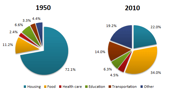
The por chart tell us the facts that household expenditures has changed a lot from 1950 to 2010.
Housing is the biggest porportion being spent in 1950, with more than 70% of the spending has been done in this part, followed by food (11.2%), and education (6.6%). In 2010, food has become the area compose the most of the familial expenses. Housing becomes the second largest porportion whilst other miscilaneous thing becomes the third largest. Notably, the transport expenses has rised dramatically in these years, judging from that it changes from the second least porotion of the expenditure in 1950 to the third largest in 2010. While almost every part of the expenditure alters a lot during this period, the ratio of edcaiton expenses in the household expenses, on the other hand, remains stable. The health care plays 4.5% of the household expenses in 2010 and was only 2.4% of that 60 years ago.
Overall, housing was the dominant part of the expenditure in 1950 and people seem to tend to spend more evenly in 2010 for the differnece among every type of the expenditure is not so obvious as it wsa.
No comments:
Post a Comment